Six Quick Hacks to Make Your Blog More Readable
You’ve crafted a massive post, full of detailed research and game-changing information. Your forehead breaks out in a cold sweat as your trembling finger reaches for the publish button. You quickly wipe your brow and take a deep breath… your post goes live.
What happens next? If it’s like some of my own past experiences (a few too many, actually) your post falls flat. You might get a few hits here and there, even a visitor or two that comments, but nowhere near what you hoped. Maybe you chalk it up to experience and work on the next post. Maybe you bite a washcloth while you cry in the shower. But what can you do so this doesn’t happen again?
While I’m not the greatest designer, there are a few neat tips I can offer you to improve the readability of your treasured posts. It’s probably one of my favorite things to do as an SEO. Here are a handful of things you can do right now to make your blog more readable.
Quick Navigation Links

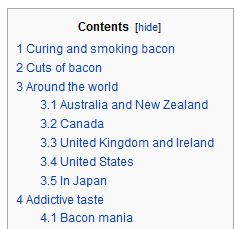
You’ve likely seen these links in Wikipedia articles, breaking down the entry into several sections. If you’ve written an exceptionally length post, it’s a great way to improve navigability and help your readers find the information they’re looking for. Here’s how to do it:
Add CSS id’s to headings where you want to allow users to jump to (as in large posts with reference-heavy content). Appending the pound sign and the id name of the element you want to jump to will give you a mini-index a la Wikipedia:
<h3 id=”cool_stuff”>Some awesome stuff</h3>
http://www.yourdomainhere.com/postname#cool_stuff
That link will jump the browser window to the section with that id. Of course, it won’t work if you have multiple headings with the same id, so be sure you limit it to one each.
Headers
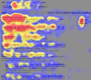
Headers break up your text in a readable and scannable manner. Every usability conference talks about how web surfers read in a “Modified F-shape.”

Understanding this pattern is crucial to sticky content. If a reader happens upon your site and it’s filled with bulky paragraphs that they have to dig through to find your point, you’ll lose them quickly.
Make sure your headers stand out from the rest of your content; try different colors, different fonts, heavier typefaces and bigger sizes until you find something that’s easily recognizable and visually appealing. See Pearsonified’s Golden Typography Ratio Calculator for a more scientific approach.
Front-Load Your Content
Pack your content with the most important information up front. Front-load sentences with crucial info, front-load paragraphs with crucial sentences, front-load posts with crucial paragraphs, and so on.
This point is pretty similar to the “Headers” tip just prior. Your readers are scanning in an f-shape, rather than pouring over every word. Make sure you hit them hard with the important information to keep them reading.
Images
Similar to headers, images help break up your content and make it feel less like you’re trying to suck down a student’s Ph.D dissertation.
Images quickly become bandwidth hogs, however, so keep your images relevant; easter-egg pictures are great and all, but too many will slow your page load time to a crawl. Speaking of which…
Make It Small, Make It Fast
Minify. Gzip. WP Smush It. Compress. Cache. Use a CDN. Get a new website. Whatever you want to do, just make your webpage faster.
The faster your stuff loads, the more likely your visitors are going to stay on your page. Not only that, research by Google from back in 2009 might even indicate that faster load times increases visitor loyalty. Didn’t know your 350 MB easter-egg picture was keeping visitors away, did you?
Cut the Crap
Do you know the best way to speed up your site and decrease distractions? You get rid of distractions. Whether that’s an AdSense block that never gets clicked, a big, flashing affiliate banner that never converts, or a really big image at the bottom of a post that your readers never seem to get to.
This is probably the easiest and quickest way to improve your user experience; get rid of the unnecessary crap on your page. That array of 5,000 social buttons at the bottom of every post? Yeah, that’s probably 4,997 buttons too many.
Cut the useless garbage out of your site. Rip it out like a shrimp’s sand vein.
So what do you think? Are there any other quick fixes you can think of to improve user experience?
